Drooms Design System
Introduction
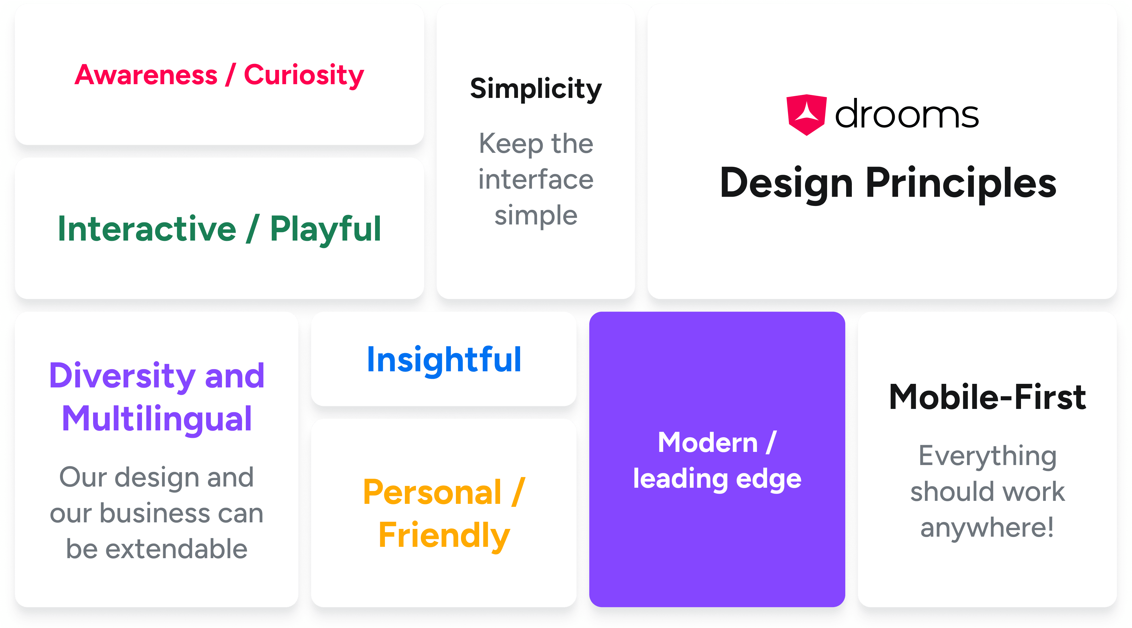
The Drooms Design System is a comprehensive framework I designed to ensure consistent, user-friendly interfaces across all Drooms products. Built with a focus on accessibility, it complies with the Web Content Accessibility Guidelines (WCAG) and Apple's Human Interface Guidelines. By blending visual consistency with cutting-edge functionality, this system not only enhances the user experience but also bridges the gap between design and development, promoting efficiency and scalability across teams.
The Drooms Design System is composed of several key components that ensure consistency, accessibility, and scalability across all Drooms digital products. These components include:
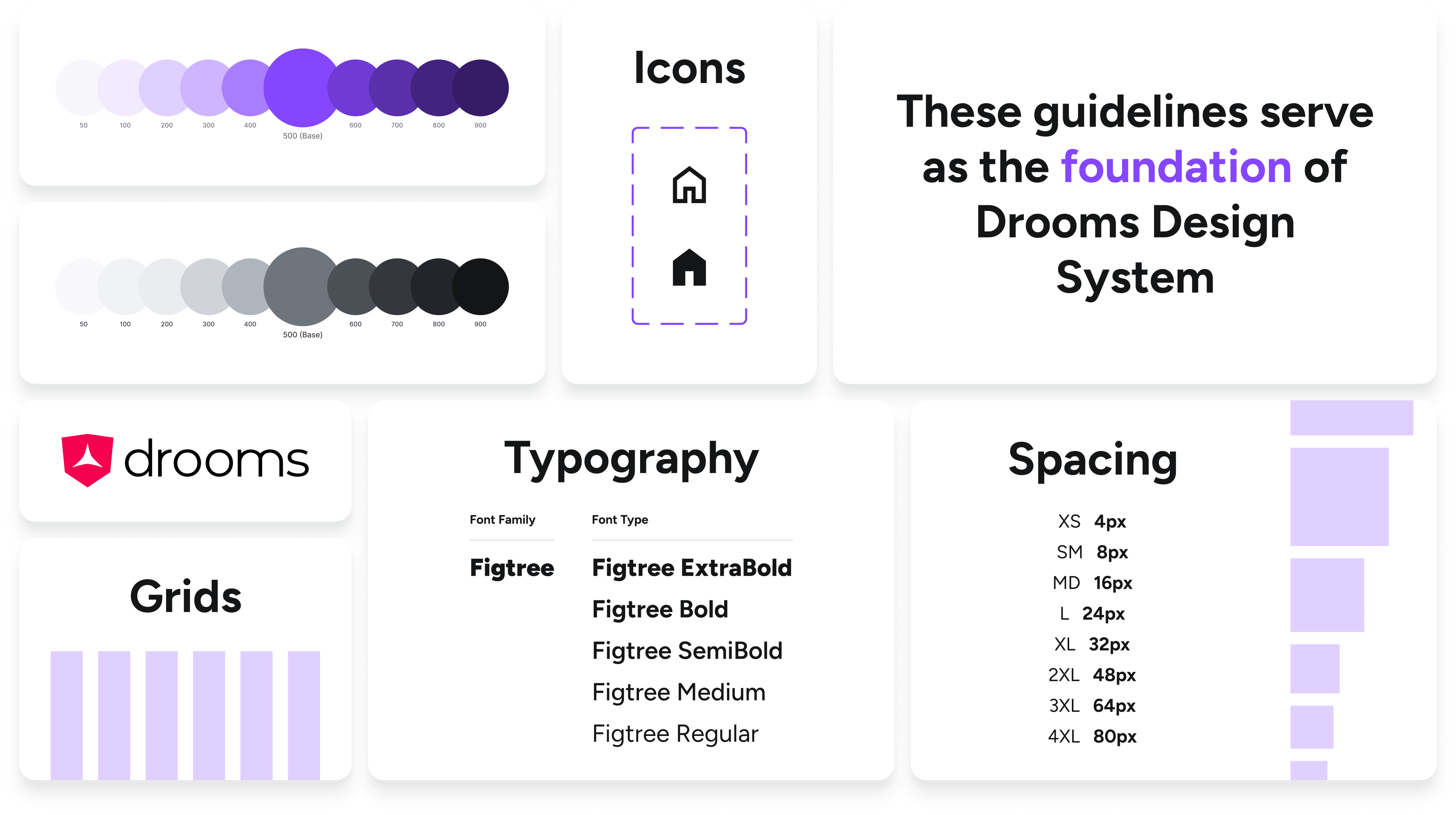
- Foundation: The core principles and design tokens that establish the system's visual identity, including color, typography, and spacing.
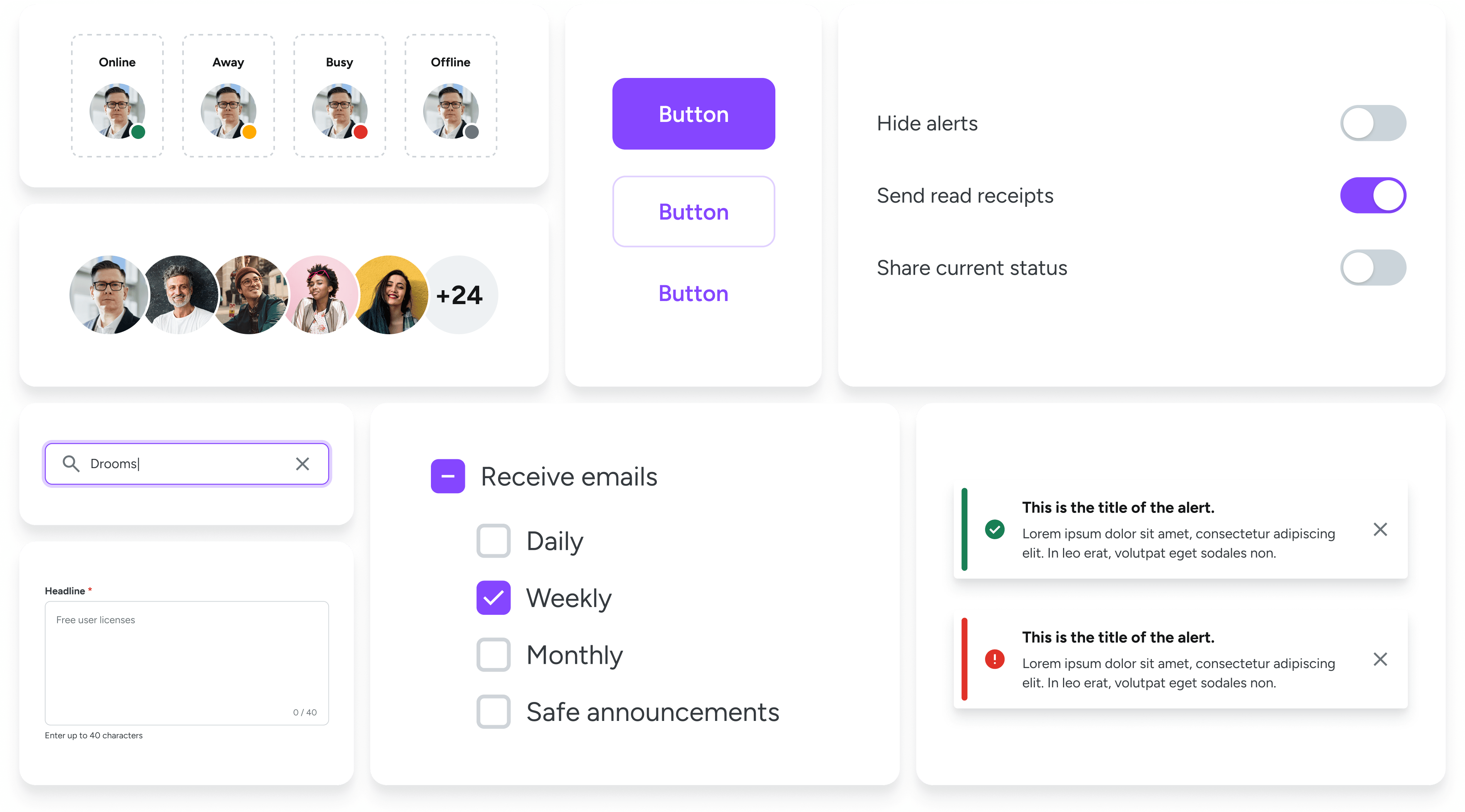
- UI Components (Desktop): A comprehensive library of reusable, responsive elements tailored for desktop interfaces.
- UI Components (Mobile): A set of mobile-optimized components designed to provide seamless experiences on smaller screens.
- Data Visualization: Tools and guidelines for presenting complex data in clear, intuitive ways that enhance user understanding.
- UX Writing: Best practices and tone guidelines for creating clear, user-centered copy across the product.
- Email Templates: Pre-designed, adaptable templates for consistent, branded email communication.
This modular approach allows for a cohesive user experience while maintaining flexibility for diverse platforms and use cases.


