Wikipedia Redesign
Introduction
Wikipedia is a popular online encyclopedia that provides free access to information on a wide range of topics. It is created and edited by a global community of volunteers and is hosted by the Wikimedia Foundation. Navigating Wikipedia can also be challenging for some users, as the site's layout and navigation may not be intuitive. Additionally, some pages may be lengthy or complex, making it difficult to find the information one is looking for. The purpose of this exercise is to highlight and possibly resolve the bothering things relating to browsing around on Wikipedia.
Problems
Upon conducting an analysis of Wikipedia and gathering feedback from users via social media platforms, several potential pain points have been identified, which are as follows:
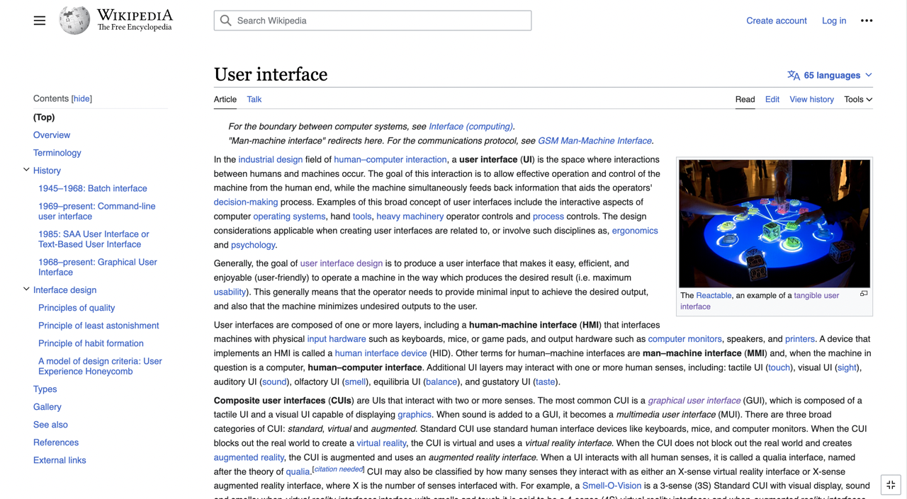
- Line length
- Hard to focus on the text readability
- Lack of accessibility on the contents
- Cluttered contents
- Outdated design
Goals
The primary objective of this task is to improve the usability of Wikipedia by incorporating heuristic evaluation by Jakob Nielsen's 10 general principles for interaction design, with the aim of creating a more user-friendly and intuitive experience for its users.
- To redesign Wikipedia for Gen Z in order to improve user experience and resolve their issues regarding research subject material accessibility.
- To implement a smooth user experience transitioning by allowing visitors to switch views.
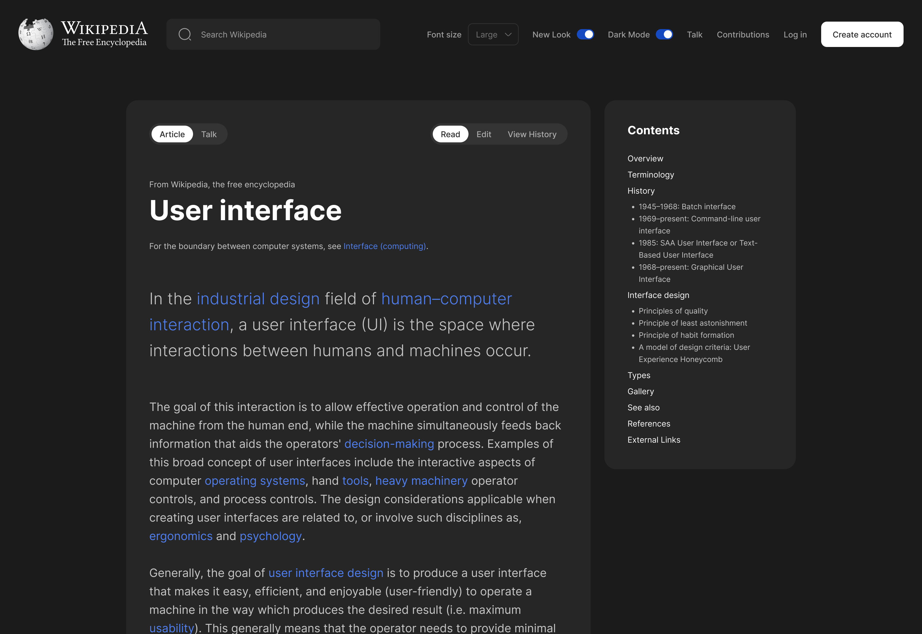
- To give more user flexibility on feature preferences. (e.g. enabling dark modes for night readers, changing text font sizes etc)
Current Design
Competitor Analysis
Before embarking on the process of devising a solution, it is advisable to begin with a comprehensive analysis of other products that serve a similar purpose, and incorporate any common/best practices into our innovative solution. To that end, after conducting research on several products such as Britannica and encyclopedia, I discovered that they all utilize short line lengths, which is a crucial element in typography, as it enhances readability and ensures that the reader remains focused on the text. Additionally, the table of contents is another key feature that aids in providing better accessibility and helps users navigate between different sections more easily.
Wireframe
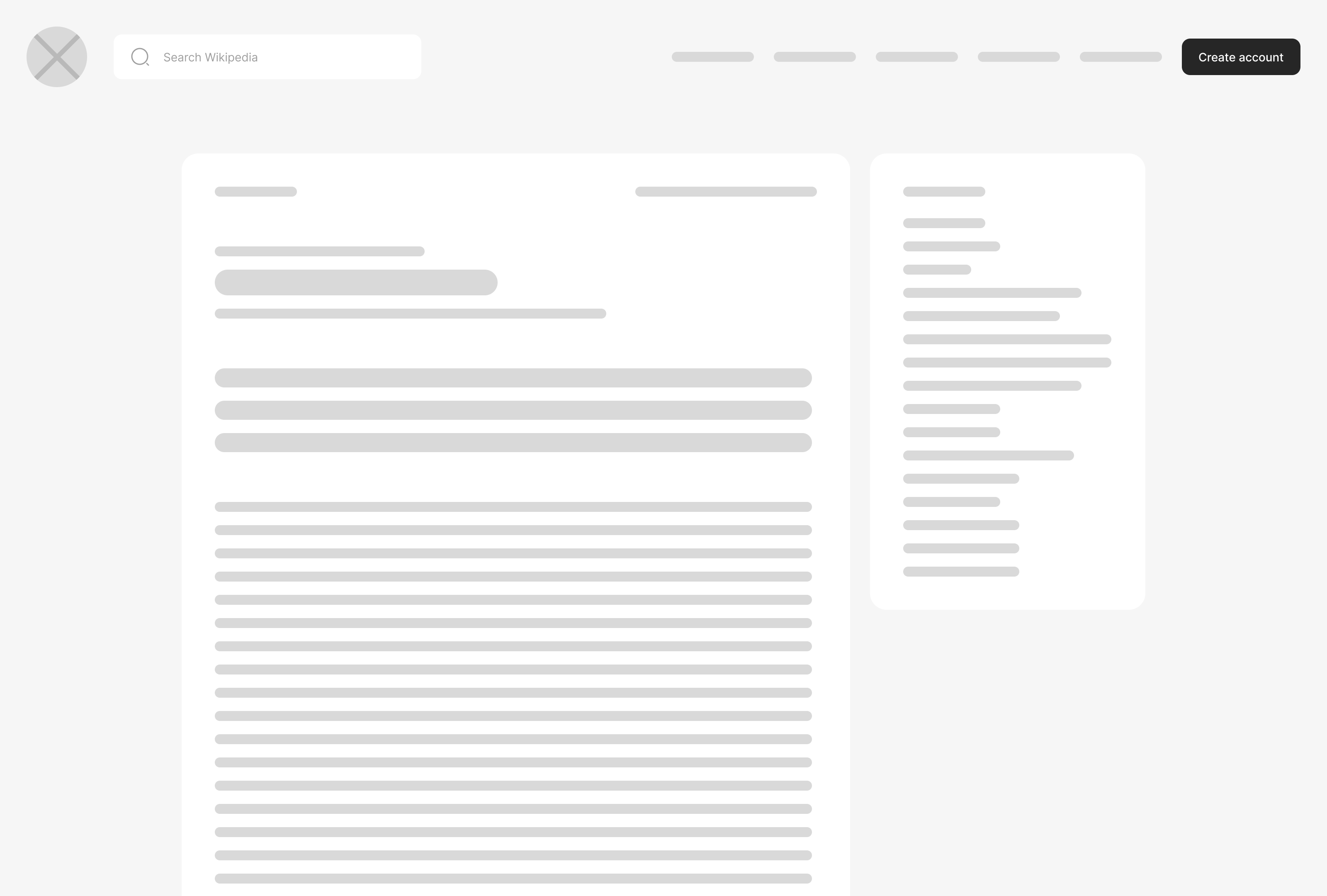
To create effective wireframes for the redesigned Wikipedia, I took a careful and considered approach. First, I closely examined the existing UI of the website, as well as those of its direct and indirect competitors, to gain a deeper understanding of the current state of the market and the user experience landscape. After making some observations, I drew out every possible layout before settling on the one that worked best. The creative design process started off with sketched out design of the layout (content) of the page as shown below.
Proposed Solution
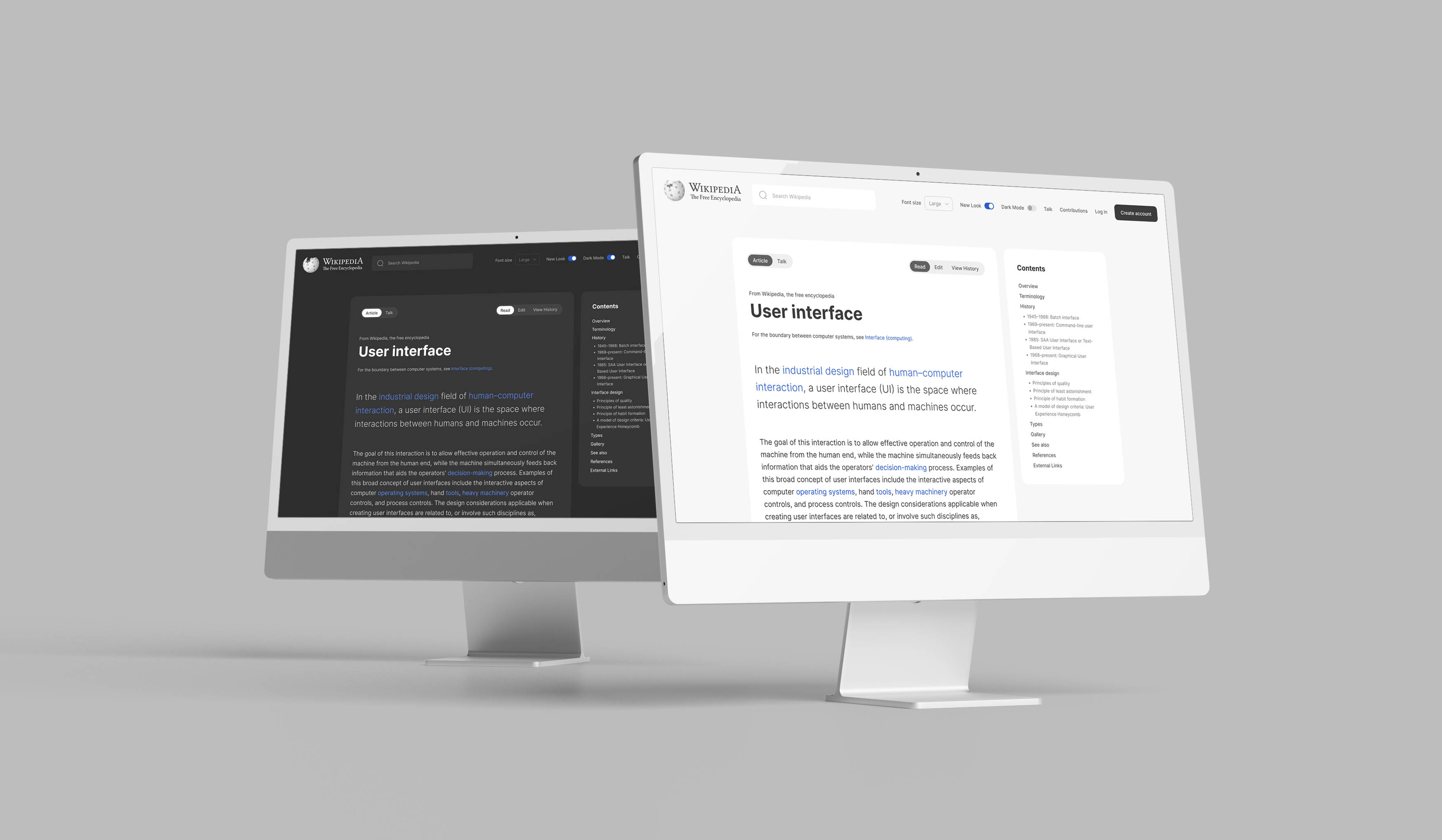
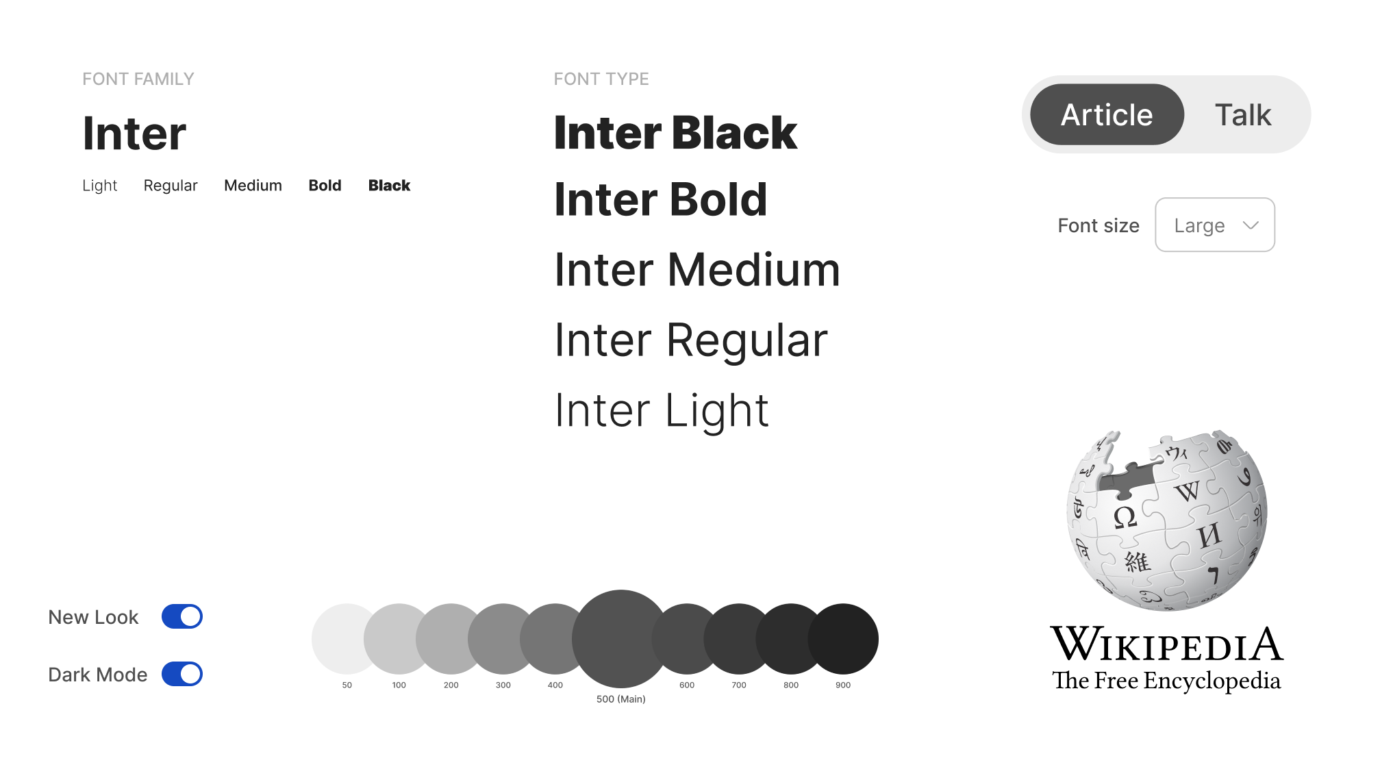
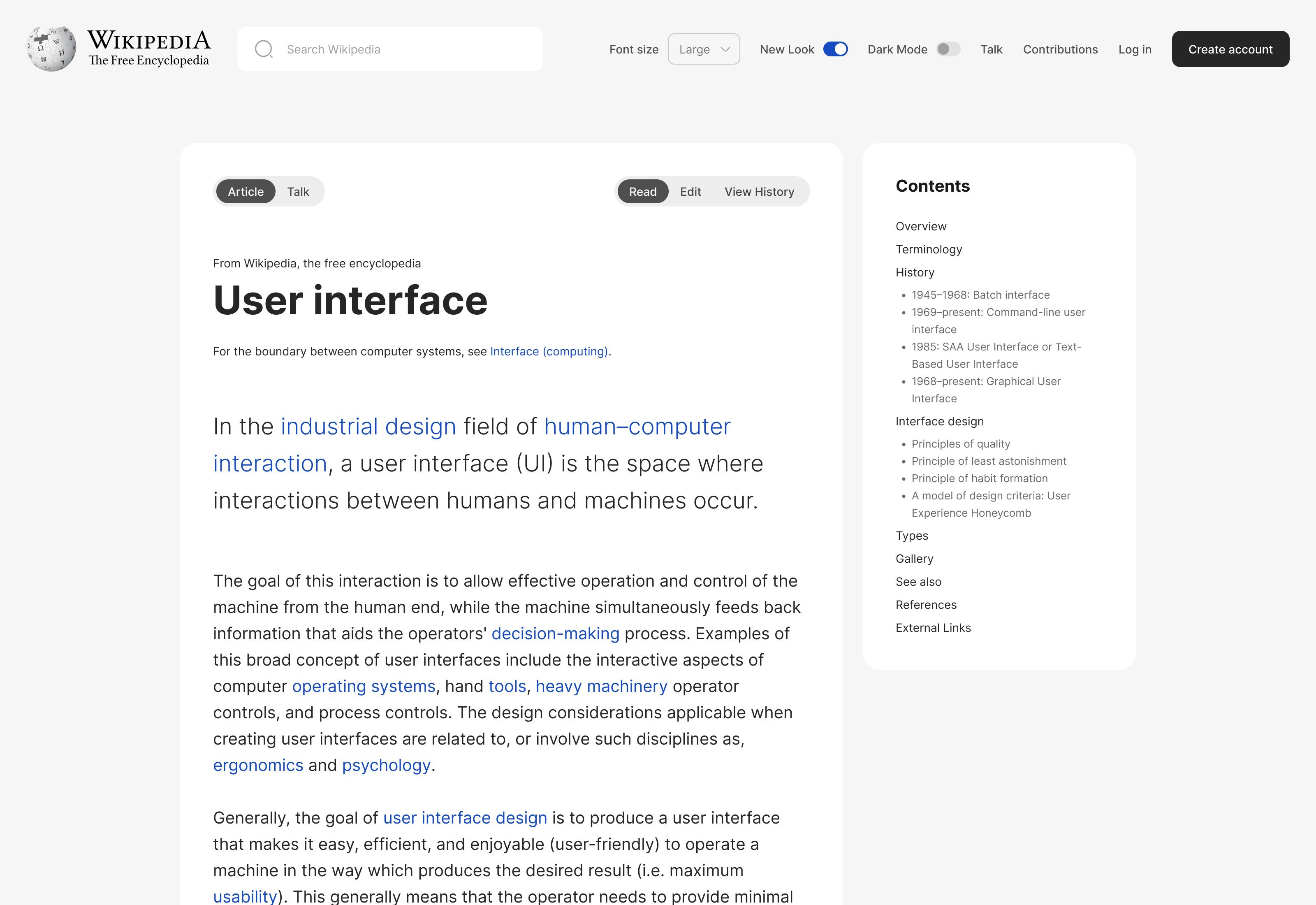
My design approach is driven by a strong focus on providing the best possible user experience for Gen Z users, while still ensuring accessibility for those who are comfortable with the current design. The approach prioritizes user flexibility by offering features such as the ability to switch between light and dark modes, adjust font sizes, and other options that allow users to customize the look and feel of the page to their liking. By empowering users with greater control over their browsing experience, the design approach aims to enhance usability and engagement while also accommodating diverse user preferences and needs.
Navbar
I completely revamped the navbar and made it sticky on scroll in order to allow users play around with the page settings without having to scroll all the way up.
Article
This is the most important section of the wiki page where the users should get the best experience while reading an article. I enlarged the font size and reduced the line length so the users won’t lose their focus when reading through lines consequently making it so easy for the users to read and have the best experience as they read.
Image
I kept the image position inside the article and enlarged the size to make it more clear while the users are reading the article.
Table of Contents
I moved this section beside the article section cause it allows more accessibility for the users to navigate through different contents. The position of this section will be sticky upon scrolling through the article and also the current section will be auto highlighted as the users scroll through sections.
Footer
The information on the footer was cluttered and I have organized it well to enhance the UI. I moved the “page was last edited” to the article section as it’s more related.
Prototype Link (Figma)
The prototype link showcases a seamless and intuitive user experience, allowing users to effortlessly switch between Dark and Light modes while reading the article. This feature enhances the overall user experience by providing greater accessibility and flexibility, as users can choose the mode that best suits their personal preferences or the ambient lighting conditions in their environment.
Open Prototype